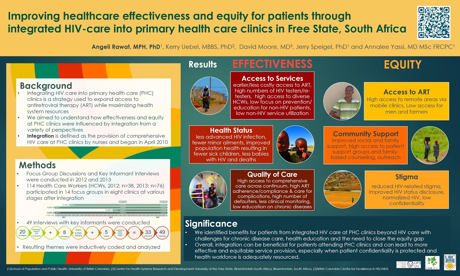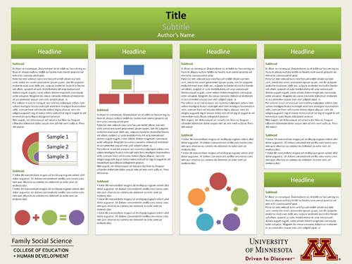
A research poster is a visual representation of the research paper. It should include all the elements of the paper paper (introduction, background, data sections, conclusion and bibliography) in addition to graphics. This lesson will address the research poster and opportunities to submit the poster to SF’s Research in Undergraduate Education (RUE) poster competition.
Lesson Objectives
- recognize elements of academic poster design for HUM2420
- develop a poster that reflects the research paper
- evaluate other student work in a peer review
- revise and submit a final research poster for a grade
Elements of Poster Design
The goal of a research poster is to share research findings in a way that will entice the audience to read the research paper. Think of the poster as the movie trailer for your paper, you want to provide an idea of what your research is about with nuggets of the best parts. The research poster also aims to inform and educate readers who will likely never read the paper. In most cases, a viewer will spend only a few short minutes observing the poster, so it important that the poster conveys the significant information in the most efficient manner.
Organization and Design

Organization and design of the poster can determine if a person takes the time to read a poster. A poster that appears disorganized with too many words and dense text can discourage the viewer from attempting to read and digest the information in your poster. This is why it is important to ensure that the elements on your poster are clean, clear and well-organized.
Flow: Left to Right, Top to Bottom
In the English-speaking world, people read from left to right and top to bottom. This makes it important to organize a poster that flows from left to right and top to bottom. Elements such as the title should be at the top, followed by the introduction and the remaining sections of your paper. In most cases people will not read your references, but they should be there. So it makes sense to place the references at the bottom or bottom-left, which is the end of the flow. This is not a hard and fast rule however. Previous students with design talent have created circular posters that are read clockwise, and square posters that read top to down. Yet, a poster does not need to be a work of art. Stay in your comfort zone, its the content that matters.
The organization of your poster should reflect the organization of your paper. Since you already know the sections of your poster, you can begin designing your poster immediately by creating placeholders where you will insert your content. You can start from scratch or download one of several free research poster templates available online.
See the list of recommended software programs at the end of this lesson, or feel free to download and adapt the prepared template below.
Go Easy on the Text
Reading a poster should not be a major commitment, and dense text can encourage a viewer to move on to an easier poster with lighter reading. Avoid copying and pasting portions of your paper into the poster. Each section should include only nuggets of the most important; the paper is available for elaboration. It is good to be as succinct as possible, and strategies such as bullet points and lists can help trim unnecessary words off of sentences. If you choose to use bullets and lists, be sure to include at least one introductory sentence to provide context on what the list is about.
Title and Subtitle
It is important to develop an engaging title that is informative and will hook the viewer into reading the rest of the poster. The title is the first thing, and may be the only thing a viewer reads on your poster. This makes the title and subtitle one of the most important elements in your poster. For example, a poster with the title ‘Nigeria’ is boring and tells the reader very little. Yet a title and subtitle such as ‘Nigeria: gender and maternal mortality in an oil-rich country’ can inform and grab the reader. Right off the bat, the reader learns that Nigeria is an oil-rich country which may contradict previous ideas that all African countries are poor. The subtitle also informs the reader that despite country wealth, Nigeria struggles with maternal mortality, and the thesis of the poster is that it stems from gender ideologies. This title would easily draw in anyone interested in subjects such as public health, global politics, and international economies.
Informative Headings
Similar to the title and subtitle, the subheadings can also inform a viewer. Informative subheadings also let the reader know what lies ahead. In the example of ‘Nigeria: gender and maternal mortality in an oil-rich country,’ an historical section titled ‘History’ tells very little. Yet an historical section entitled, ‘From Colonialism to World Trade’ lets the reader know that the section will provide the historical background of Nigeria that is relevant to the topic. Remaining subheadings such as Maternal Mortality, The Oil Economy, and Gender Ideologies, let the reader know how the poster is organized.
Personal and School Details
Every poster must include personal information about the person that created the poster. This not only provides credit to the individual that conducted the research, it also acknowledges the school and course where the research took place, the date the research occurred, and may acknowledge any funding that supported the research. Since this information will not change during the semester, it is a good idea to go ahead and immediately insert it into the poster.
- Name
- Major
- Date
- Course (HUM 2420 African Humanities)
- Santa Fe College Logo (see Santa Fe’s SF Logo branding site for logo options)
Graphics
The poster is a visual representation of your research, and a picture is worth a thousand words. This makes graphics a critical tool for decreasing text in your poster while conveying useful information. Virtually every section inyour poster should have some type of image that communicates information to the reader: an image, chart, or graph.
Therefore, every poster produced for this class should include the following graphics:

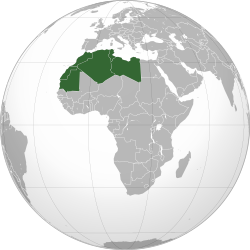
- Map of Africa showing country or region: Every poster must have a map of Africa showing location of the countries or region that is relevant to your research topic. If your topic addresses cultural phenomena within a single country, such as Islam and Christianity in Nigeria, it s also a good idea to provide a map showing intra-national variations. Although Wikipedia is not a scholarly source, it can be a useful tool to locate informative maps of Africa that highlight specific countries or regions. The map to the right, for example, was taken from the ‘Maghreb’ page in Wikipedia. Maghreb refers to Arabic sub-region of northwest Africa and consists of Algeria, Libya, Mauritania, Morocco, and Tunisia. The map on the Wikipedia page shows the African continent with the Maghreb countries highlighted.
- Charts and Graphs to show data: Charts and graphs can present raw data in a way that makes it easy to understand. For example, a timeline can present chronological events, a pie chart can show proportional data such as the religious composition of the country population, graphs can show changes over time, and charts can present comparative data. Like all images, charts and graphs taken from the internet must be credited to the source if it is not already within the image. There are several sources for charts and graphs:
- Use the ‘Insert’ option in Powerpoint and select ‘Chart’ to begin building your own
- Online graphic design programs, such as Gliffy or Lovely Charts, make chart making easy

- Photos of People: Every poster should have at least one image of a person or people that ties the research topic to the human-ities. People should be engaging in specific activities related to the research topic. For example, a poster addressing hip hop and democracy in Kenya could include an image such as an album cover or a shot of young people voting. If your topic addresses unpleasant issues such as violence or famine, be sure to avoid focusing on pejorative representations of African people and instead cast light on the ways people are working to address problems and issues in the country or community. Refer to the Orientalism lesson and be weary of participating in the Euro-centric history of reproducing the same stereotypes and negative representations of Africa and African people.
All images must be captioned and credited to the source and/or producer of the image. The credit can be included in the caption or in the same in-text referencing style used for the References section. If you personally created the graphic (ie you took the picture or created the chart), credit yourself so it does appear as an oversight.
Useful online sources for free images include:
- Unsplash provides free images with credit to the photographer
- Wikimedia Commons provides free images with credit to the photographer
- Online databases such as Shutterstock, Getty Images provide images for a fee.
- Many free graphic programs such as Canva and Easelly include free and inexpensive ($1) images
- Google Images offers free images, but the search must be set to ‘Creative Commons Licenses’ via the ‘Tools’ setting.
Poster Design Programs
It does not matter which program you use to produce your poster provided you can save the image as a jpg. Powerpoint and Microsoft Publisher are simple and powerful tools to use. Adobe Illustrator and Photoshop can produce amazing posters, yet they are not easy to learn within a short amount of time. There are also a wide variety of free online graphic design programs such as Easelly and Canva that include poster presentation templates. Given the limited amount of time available to produce the poster this semester, it might be best to stick with a program you are already familiar with.
Click on the links below to watch one or more poster-making tutorials using software programs found on most computers at Santa Fe College.
Free online programs to create research posters and infographics include:
After you have decided on the program that you will use, review the assignment description for the research paper to be sure that you include all of the expected elements. Use the checklist below to ensure that you do not forget anything.
Final Poster Checklist
| ? | Poster Design Check List |
|---|---|
| X | Title and Informative Sub-Title |
| X | Details: Date, Name, SF Logo, HUM2420: African Humanities, etc. |
| X | Introduction: This section includes your thesis statement and introduces what is in the poster. (Should be at the top or top left.) |
| X | Socio-Historical Context: This section covers history and can be in text or timeline form. (Should come after the Introduction) |
| X | Three topical sections: These are the points addressed in the thesis and introduction section. They should have at least one graphic. |
| X | Conclusion: This draws from data to conclude, ie ‘In light of ….’ |
| X | Map: Every poster must have a map of Africa showing location of relevant countries, region, etc. |
| X | Images of People: |
| X | Charts and Graphs: Should include at least one sentence to provide context, and cited if it is not an original. |
| X | References: Must be properly formatted, scholarly, and cited in-text (Should be at bottom and/or right) |
| X | Images Cited with Sources: Google Images is a search engine, not a source. |
| X | Spelling, Grammar, Writing Style: Conduct a spellcheck, read aloud, ask a friend to look it over. |
Research in Undergraduate Education (RUE) Poster Competition
It is a good idea to consider submitting your poster to Santa Fe’s Research in Undergraduate Education (RUE) poster competition. Previous students in this class have placed in the competition, and it is a great opportunity to win prizes and add a line to your academic resume. Posters from this class will fall under the Analytical Research Category.
Analytical Research – Analytical research projects analyze concepts, interpret texts, and form arguments, etc. Generally speaking, the work in this category includes analyses in support of theses or explanations of difficult concepts, not merely summarization or recitation of known positions. Projects for this category can originate in any department or field of inquiry.
See the RUE Festival page for more information
To submit your poster, visit the RUE page on the Santa Fe College website.
References and Resources
- Designing Conference Posters by Colin Purrington
- Poster Basics by NYU
- How to Design an Award-winning Poster by Animate Science
- Artsy Conference Poster Design Ideas on Pintrest
- Additional Free Powerpoint Poster Templates
- Design a fabric research poster with Canva
- Design a Research Infographic with Easelly
For Discussion in Canvas
Submit a finished version of your poster for peer review. Save the poster as a jpg (go to ‘Save As’ and select JPG in the drop down menu) and embed it in the post. (Be sure to save the original version of your poster so you can go back and revise after receiving feedback.) Feel free to use the template below.
Use the criteria described in this lesson to provide constructive criticism to at least three other student posters on ways to improve their poster. After completing the peer review, revise your poster and upload the final version to Canvas to receive a grade. If you did not submit a poster for peer review, it is still a good idea to read the critiques so you get a sense of how you can improve your own.
For Extra Credit: Submit your poster to the Research in Undergraduate Education (RUE) competition and post a screenshot of the submission confirmation email in the discussion.

